Divi! It's fantastic at many things but misses some of the basics. Like, switching column order on mobile. This is one of the most basic things for mobile layouts. Let me show you what I'm talking about.
A two-column layout is pretty popular and basic. In one column, we have our text and in the other, we tend to have an image. If you want the image first on mobile, which is usually the case, the image on the left, text on the right works perfectly!

Smooth as an android's bottom, eh, Data? Well, I'll say this for him - he's sure of himself. I guess it's better to be lucky than good. Computer, belay that order. Well, that's certainly good to know.
But, what happens when the image is on the right and the text is on the left? The image goes below the text when the columns collapse. Check out what I'm talking about. Decrease your browsers window or if you're on mobile, you already see what I'm talking about.
I suggest you drop it, Mr. Data. Sorry, Data. The Enterprise computer system is controlled by three primary main processor cores, cross-linked with a redundant melacortz ramistat, fourteen kiloquad interface modules. Is it my imagination, or have tempers become a little frayed on the ship lately?

Yikes! That's not what we want, at all. Fortunately, there is an easy fix. It's called Flex-box.
The Solution
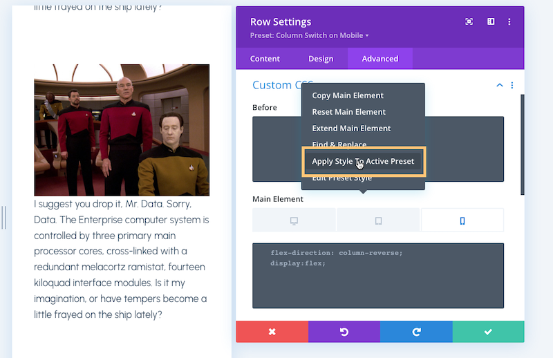
This is going to be a quick and easy one. Go ahead a create a two-column layout. Put the text on the left and the image on the right. Now, in the Row Settings - Advanced Tab - Custom CSS - Main Element - mobile area, Add flex-direction: column-reverse and display:flex. You can see that this switches the column order!
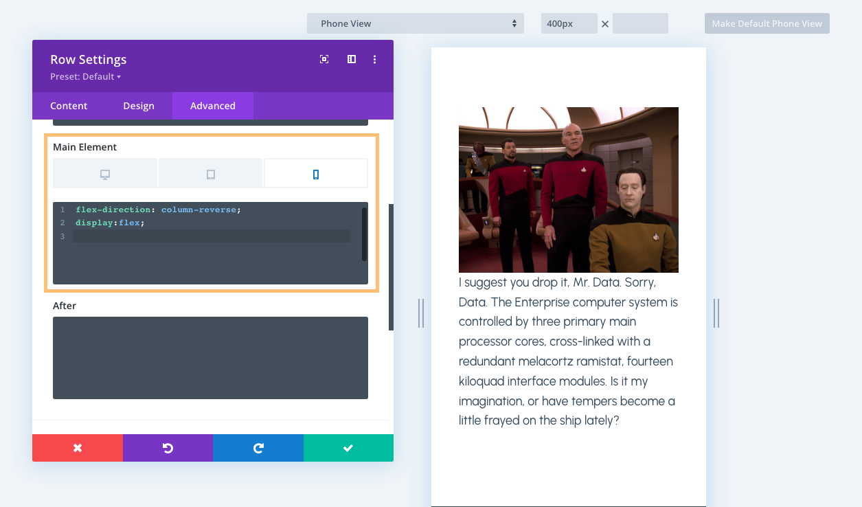
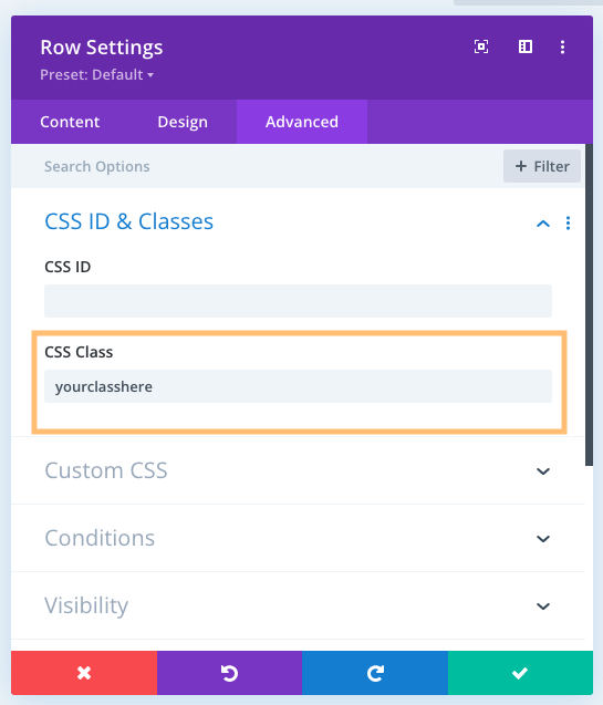
You can save this for the future in a few ways. You could create a class for this and add it to your stylesheet. Just make sure you add your class name to your Row Settings - Advanced Tab - CSS ID & Classes field.
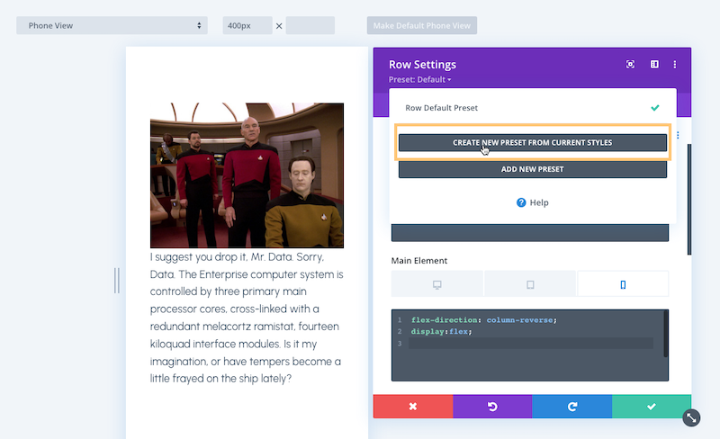
Or, my personal favorite, is create a Preset and be able to use it a little easier than having to remember a class name. For some reason this isn't as easy as it should be. It's a three step process.
First, name your preset something that makes sense and is easy to remember.
Second, you have to go back to Row Settings - Advanced Tab- Custom CSS - Main Element and click the three dots.
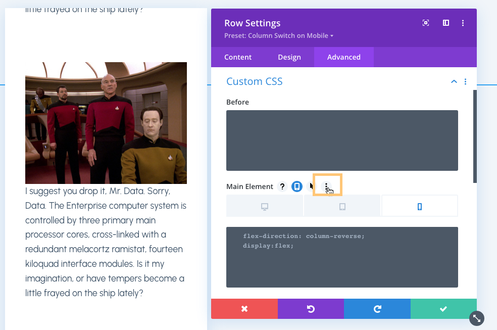
Last, choose Apply Style To Active Preset. Why do you need this last step? I'm not sure. It should be saved to the preset when it's created but it's not.
Welp folks, that's it. Pretty easy and all thanks to a little flex-box! Check out the example below.
I suggest you drop it, Mr. Data. Sorry, Data. The Enterprise computer system is controlled by three primary main processor cores, cross-linked with a redundant melacortz ramistat, fourteen kiloquad interface modules. Is it my imagination, or have tempers become a little frayed on the ship lately?
